|
0 Comments
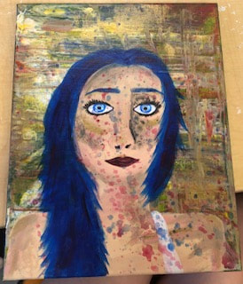 In this piece, I painted a random and slightly chaotic picture of a girl. This painting gives me slight pop art vibes. I decided to paint this by just putting my brush all over the canvas and seeing what happened. My heart decided to do this.
Pros: -The pros of this piece were the background, hair, and vision. I love how the background turned out! It's super chaotic and full of color. The hair turned out cool in my opinion because it has streaks of different colors throughout. Lastly, my vision for this piece looks exactly like the final result! I also like how the gold paint looks like highlighter on the girls face. (You can't really see it in the picture because of the lighting.) Cons: -The cons of this piece are that the eyes didn't stand out as much as I wanted them to, and the piece looks a little flat. Process: -I started this piece by working on the background. I did an acrylic pour technique. I placed dots of paint across the whole canvas and used a palette knife to spread it in different directions without blending it. This creates a cool pattern that's chaotic and abstract. I let these layers dry overnight, and the next day I created skin tones and painted the human form on top of the acrylic pour. Then, I added the facial features, hair, tank top strap, and definition to the details. Finally, I splattered paint randomly across the canvas and added shiny gold paint on the high points of the woman's face. 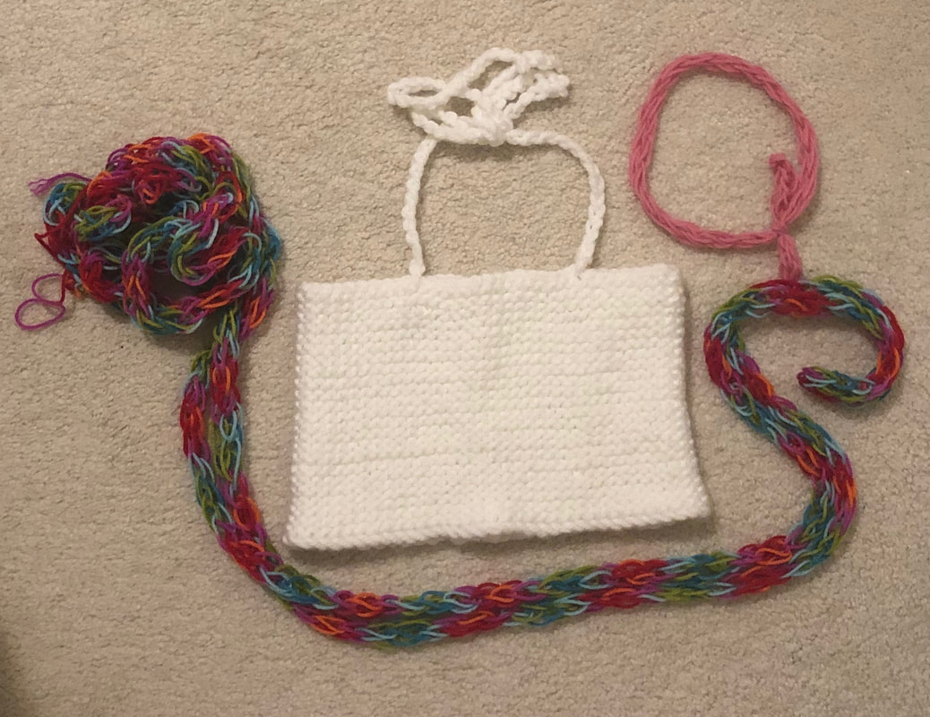 Pros and Cons:
-Pros: One thing I really liked about this set was the range of colors I used. Typically I use a limited color palette in my works, but this piece was rather varied. Another pro of this piece was how perfect the top came out. Usually when I knit, mistakes are made and there are holes or imperfections. This piece was flaw-free! I liked how the whole outfit worked together as well. I had a head piece, a crop-top, and a rope that was tied around my waist and hung low. All of these items balanced each other out and made a whole look on the model. -Cons: The things that I would do better next time would be the straps on the top and the edges of the rope. If I were to do this again, I would have sewed the straps onto the inside of the top instead of attaching them at the uppermost knitted chain. This would have made the straps less fragile and less likely to break over time. The ends of the colorful chain look unfinished and if I were to do this project again I would have done more finishing work on them to make them look clean. Overall Process: I started this set of art pieces by knitting a rectangular shape with thick opaque white yarn. I used super long knitting needles to achieve the desired length. I then took an embroidery needle and sewed the rectangle into a tube shape. This tube became the crop top. I finished the top with two crocheted chains that I attached as straps. The straps tie around the neck and form a bow. I then fingerknitted a small pink chain and tied it into a 1920's themed headpiece. Lastly, I fingerknitted a VERY long rope with rainbow yarn that I used as a statement belt. 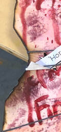 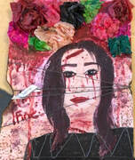 1. The first medium I used was glue. I laid it down in an even layer and applied tissue paper on top to give a sheer pink background. My next medium was tissue paper. I formed the paper into flowers and attached them to the top of the piece. Next, I used acrylic paint to outline and define the lady in the picture and the details in the background. Then, I used real makeup to set the girl's face and give it a matte finish. I used a translucent setting powder. My next medium was fire. I burned the edges of my piece and the flowers at the top to give it a charred look. Then, I chose my next medium and I tied string around the burned edges. Finally, I used the paper print out of my theme and ingrained it into the piece by gluing it to the string.
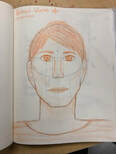
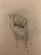
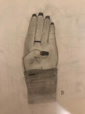
2. My word was horror. In my piece I showed things that scared me. The first thing that scares me is feeling restricted and constricted. The string and fire symbolize this because as the strings get tighter on the piece, the sides begin to fall apart. This means that as I feel more and more constrained in a small space, in a mundane routine, or strict rules, I break down. Next, the blood coming from the eyes is just a cliche element I thought I would add to the piece. Also, it just looked cool. I am afraid of anything medical related so all the injuries on the person in the photo reflect that fear. The flowers are a contrast because they are beautiful, but in my piece they were burned because I fear losing good things in life. In the end I decided to make this a more personal piece, so the meaning is not apparent when a random person sees it. 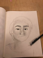 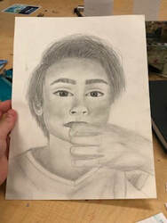 1. I did a portrait of my friend Jackson. My relationship with him is a friendship since 2013. I met him my first day of 6th grade and I like his face so I decided to draw him. He is a very pretty human being.
2. I used different weighted drawing pencils as my medium. 3. My process began by sketching out the proportions of his face lightly with an HB pencil. I next began to draw details on the sketch such as the eyes and nose and hand details. Then, I went in with a darker pencil and began shading the shadowed areas of the picture. Finally, I darkened and highlighted the key areas. 4. I found the whole piece overall successful, especially the eye region. I like the way that his expression matches the original picture almost exactly. I tried to keep the emotion the same in the drawing as it was in the original selfie. If I were to do this piece again, I would focus on the hair more to make it seem more full and try to make the shading and shadows less muddy. I think I pressed too hard on the paper when shading the cheekbone and forehead area and I would make a conscious effort to use a lighter hand.
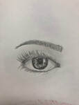
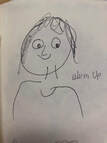
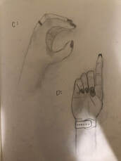
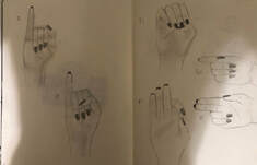
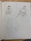 1. The most helpful warm up was the nose warm up. I had no idea how to draw noses and I always struggled with them and this warm up really helped me understand the proportions and shading to make it look as realistic as possible.
2. The most surprising thing I learned is that your eyes are actually halfway down your head. I always thought they were further up and I was surprised to hear this. At first I thought it looked weird, but after I mapped out all the other features I realized how accurate the statement was. 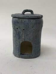 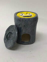 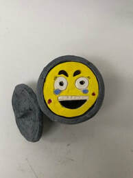 -Since the in progress post, I have completed this piece using multiple techniques. I finished painting with acrylic paint and sprayed it with a sealant. I did not use a glaze nor did I fire it again.
-The successful part of the finished piece is that it never broke and i managed to make the smiley guy fit perfectly without getting stuck which was a struggle previously. Also, I achieved a shiny finish without using glaze and still preserved the acrylic color. -If I were to do this project again, I would have made sure that the cylinder shape remained in tact and never warped. The right side of my project is slightly bowed outwards and I would have prevented that if I did this again. 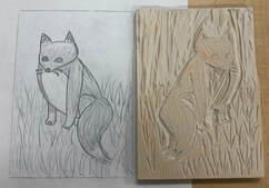 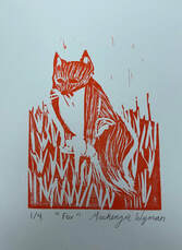 -My piece shows off the theme of line, because every detail in the fox and grass was made with varying line weights. I used 3 different attachments on the cutting tool for these different line weights.
-My piece was successful because the negative space made the little fox stand out. Also, I was nervous about the fox's bottom half details getting lost in the grass, but the distinction ended up being clear. If I were to do this piece again, I would have added some background detail with a gel pen and cleaned up some of my lines to make the fox stand out and enhance the detail. Now that I know how to use the tools and I have figured out the tricks, I think I would really enjoy doing another linocut piece! 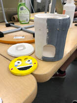 1. This piece is a trash can shaped candle holder. There is a weird face that is inset into the piece as well just for laughs, because this piece is overall lighthearted and symbolic. I plan to finish this by painting the whole vessel and lid grey as well as doing the finishing details on the little guy. Then, I will add destruction and glitter glue as well as all sorts of messy things to the outside of the trash can to make it seem worn and used for many years in an art room! My finishing step will be to add a finishing spray after all the detail work is done.
2. I found it difficult to keep the cylindric shape consistent throughout all the processes of the clay being fresh and leather hard. The piece would warp, and I think I should have made it slightly thicker. Also, making the little face fit perfectly into the lip I created was difficult as well because it got stuck a few times due to the fit being too tight. 3. The thing I found successful was that my piece looks like trash which is exactly what it is supposed to be. Also, on a more serious note, All of my piece stayed together due to the score and slip techniques I used throughout and there has been no breakage, even after it was fired in the kiln. 4. I started off making this piece by wrapping clay that I rolled out into a slab around a PVC pipe. I then created the bottom with another slab and score and slipped it on to the cylinder. Then, I added a lip with a snake of clay. I created the little guy and the lid with the ribbon tool and Exacto knife, made small details throughout, and then let it dry to become greenware. Then I fired it in the kiln and it became bisqueware. I began to paint with acrylic, and thus the trash can in the picture (above) was born. |